

Introducción
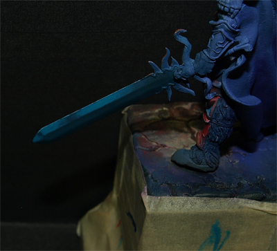
Buenas chic@s voy a intentaros mostrar cómo hacer un NMM
sobre una espada de 54mm, esta técnica se puede extrapolar a cualquier otra
superficie.
La idea consiste en representar un metal sin usar colores metálicos
( los que tienen las virutillas brillantes). Los NMM tienen un pequeño problema
y es la falta del contraste entre brillo y no brillo que tienen los metales,
para simular este efecto tendremos que forzar mas el resto de contrastes,
especialmente el de claro oscuro entre luces y sombras. En un metal normal no
tenemos porque llegar a un plateado muy claro y a un negro puro (normalmente)
para que quede un buen metal, pero en el caso de un NMM tendremos que llegar a
blanco puro en algunas zonas y a negro puro en otras.
Introduction
Hello
everybody, I'm going to explain you how to do an NMM using a 54mm scale sword, but
this technique could be used as well in any other surface.
The main
idea is represent metallic colors without using metallic colors (contains
metallic shavings). NMM are more difficult to create because doesn’t have the
metallic contrast itself, so we have to force the rest of the contrasts,
specially the contrast between lights and shadows. When we use metallic colors,
it’s not necessary to reach pure white for lights and pure black for shadows, but
in a NMM it is.
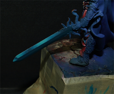
Interpretación de Volúmenes
En los metales y NMM suele quedar muy bonito juntar luces
muy fuertes con sombras muy fuertes al igual que elegir varios brillos. En mi
caso he elegido tres brillos, uno sobre la mitad de la espada, otro en la cercanía
de la punta y otro en la punta, esto nos va a delimitar donde estarán los tonos
medios y las sombras.
He hecho un pequeño croquis donde se marcan en rojo las
luces más fuertes, en azul el tono medio y en verde la sombra máxima. Como veis
en las zonas cercanas a la punta el tono medio nos hará el juego de sombra.
Interpreting
volumes
When
painting metals, it’s important to look for big contrast between lights and
shadows and creating some glitters. In this case, we have selected 3 glitters,
one in the middle of the sword, another one near the tip of the sword, and the
last one on the tip, and these glitters will set where the medium tones and
shadows will be.
In this
image, you can see the strong lights in red, blue the middle tone, and in green
the maximum shadow. As you can see, in the tip zones, the medium tone will work
as shadow.

El filo de la parte central, aunque sea plano lo interpretare como curvo dado que creo que puede quedar mas bonito. El filo de debajo del todo simplemente lo dejare en sombra.
The central
edge, although it’s plain, I’ll paint it as curved because it will be more
realistic. The lower edge will be all in shadow.
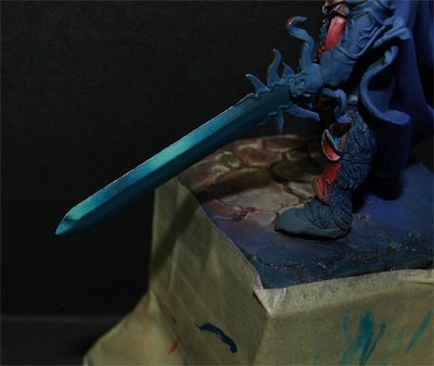
¿Como muevo el pincel?
Tendremos que mover el pincel hacia la zona de luz cuando estemos iluminando y hacia la zona de sombra cuando estemos sombreando. Esto quiere decir que cuando estemos iluminando terminaremos la trazada(levantaremos el pincel) en las zonas de luz que hayamos elegido previamente.
La unica zona de luz que tiene algo de misterio, en este sentido, es el brillo central. Tendremos que llegar a el desde arriba y desde abajo para que nos quede bonito el degradado. En la siguiente foto(siguiendo los mismos colores que antes) indico donde deberemos(aproximadamente) de empezar a iluminar y donde pararemos(levantaremos el pincel)
Moving the
brush
We have to
move the brush to the maximum light zone when illuminating and to the maximum
shadow zone when shadowing. This is, when we were illuminating we will finish
the trace in the point where the maximum light should be.
The central
glitter, should be done from lower to the medium zone, and from upper to the
medium zone. Next image (being the same
colors legend as before), shows where begin and finish painting.

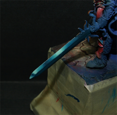
Colores y capa base
Puesto que quería una espada con un toque azulado he elegido los siguientes colores: Turquesa, amarillo hielo, blanco, blando de Golden, negro, tinta purpura y tinta negra. Intentare crear contraste entre la luz media con un turquesa con amarillo hielo y la sombra intermedia turquesa con algo de oscuro. Este sera el principal contraste de color en la espada y luego tendremos el contraste fuerte de claro oscuro entre el blanco de las luces mas fuertes y de las sombras mas oscuras, este ultimo contraste es que el nos dará realmente la gracia al asunto.
El blanco de Golden es un blanco mas intenso que el blanco de GW, por eso lo usare en algún punto de luz y perfilados.
Colors and
base layer
Having in
mind I want to paint a bluish sword, I have select the following colors: turquoise
(Vallejo), ice yellow(Vallejo), white(Vallejo), white (Golden), black(Vallejo), purple and black ink (liquitex).
I’ll try to
create contrast between the medium light using turquoise mixed with ice yellow,
and the medium shadow using turquoise with a little bit of black. This will be
the main contrast color in the sword, and after this, we will have the strong
contrast between the white (maximum lights) and black (maximum shadows). This
extreme contrast, will give the NMM a realistic effect.
I use
Golden’s white, because it’s more brightness than the GW one, so I will use it
to so some points of light and for outlining.

Para el color base he elegido un azul oscuro que consigo mezclando una pizca de negro con turquesa. Es importante que la base nos quede bien uniforme.
For the
base color, I have selected a dark blue mixing turquoise and black. It’s very
important to paint a uniform base layer.

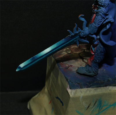
Primera Luz
Puesto que el color base que he elegido es algo oscuro, empiezo a iluminar con turquesa puro y marco prácticamente toda la espada menos la zona de sombra, este tono es el que hará aproximadamente el tono medio.
First light
As the base color is dark, we begin to illuminating using turquoise, painting all the sword unless the shadows zones, this tone will be the medium tone.

Luces no muy intensas
Empiezo a iluminar con turquesa mas amarillo hielo añadiéndole sucesivamente mas amarillo hielo a la mezcla y terminando la trazada en las zonas de luz. Yo entiendo una luz como una microbase, dado que es un color uniforme en una superficie pequeña. Si nos quedan cercos, lo que tenemos que hacer es insistir en esa zona pero dejando secar bien entre capa y capa.
Cada vez que añado mas amarillo hielo reduzco la superficie en la que aplico la pincelada para lograr un degradado.
Second Lights
I start illuminating
using turquoise plus ice yellow, adding more and more yellow to the mix each
time, and finishing the trace in the light zones. This light should be as a
little base layer, this means that should be uniform. To avoid the fences, we have
to insist letting it dry before layer and layer until the color is uniform.
Each time I
add more yellow to the mix, I also reduce the surface where I apply it,
creating a degraded.


Luces intensas
Cuando llego a un azul aturquesado clarito (sin llegar a amarillo hielo) me dispongo a marca las luces mas fuertes añadiendo blanco a la mezcla. Terminaré este paso marcando alguna zona con blanco puro de GW.
When I
reach the a very light turquoise (but not ice yellow yet) I mark the strong lights
adding white to the mix. I finish this step marking some zones using GW pure
white.
Maximum
lights


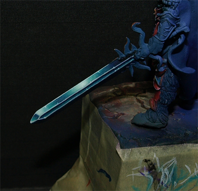
Filo central
Para ir viendo realmente el conjunto de la espada me dispongo a pintar el filo central, para ello simplemente hago un pequeño degradado hacia abajo con turquesa. Si nos salimos un poco, no pasa nada dado que con el perfilado lo arreglaremos.
Central
edge
To see
better the whole, I’m going to paint the central edge, so I just do a little shade
off to the lower part using turquoise. It
doesn’t matter if we paint a bit the lower part. The outline will correct those
imperfections.

Dado que comencé con una base oscura, prácticamente no tenemos que sombrar. Aun asi sombreo hacia la zona de marcada como verde con tinta purpura primero y luego tinta negra.
Me dispongo a perfilar en luz todos los cantos con blanco de Golden y en sombra la parte alta del filo intermedio con tinta negra. Como veis los perfilados son vitales para que nos quede un buen metal o NMM, dado que nos dará limpieza y definición .
Shadows and
outlines
As I start
using a dark base, there’s not much work shadowing. But we make some shadows on
the green marked zones using purple ink and after that black ink.
After that,
I will outline the upper part using golden white, and outline with black ink in
the upper part of the central edge. The outlines are essential when painting
NMM, because they will give us definition and cleanness.

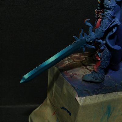
Remate final
Limpio alguna transición a modo de veladura con turquesa y remarco algunos brillos con blanco de Golden. Los brillitos suelen quedar muy bien la zona cercana a los perfilados en luz dado que intentan simular destellos.
Final details
I clean the
transitions using turquoise layers, and I mark some glitters using golden
white. They should be near the light outlines, as they were real glitters.
Espero que os haya resultado interesante y de ayuda. No dudéis en hacernos transmitir cualquier duda o sugerencia.
Un abrazo. Zwo
Regards! Zwo
Menudo TUTO no tiene desperdicio! gracias por facilitarnos tanto el aprendizaje!
ResponderEliminarMuy bien explicado, y excelentes diagramas. ¡Gracias por el trabajo!
ResponderEliminarBuen tuto. El filo de abajo creo que deberia tener aun reflejo secundario para que funcionase mejor. Y los perfilados algo gordotes.
ResponderEliminarMuchas gracias chicos, me alegro de que os guste.
ResponderEliminarPense en hacerle algun frelejo secundario a la zona central, pero el filo de abajo esta totalmente en sombra, creo que queda mejor asi. Al final me decante por algo mas rapido y sencillo. Si, tengo que retocar algun perfilado, sobretodo los que delimitan el filo central me han quedado mas reguleros porque al ser una superficie casi plana me costo hacerlos.
Dentro de no mucho esperamos ofrecer videotutoriales en Eureka, ahi lo dejo jaja
Menudo tutorial...Cuando mariquita quiere.. para todo tiene maña ehh :)
ResponderEliminarMola muchissimo! Quiero una espadaca ya para practicar!! Mwahahahhaa
ResponderEliminarThanks you. That was very easy to follow. Lovely work :)
ResponderEliminarbuena tarde parcero, tengo una duda, en los pasos en que empiezas a agregar las luces, diluyes los pigmentos¡? y si es así, en que proporción¡? muchas gracias y esta muy bueno este tutorial.
ResponderEliminarGracias Marcos. Siempre hay que diluir la pintura, yo suelo diluirla mucho para sombrear, algo menos para iluminar y poco para dar una capa base.
ResponderEliminarTienes que lograr una disolucion en la que tu te encuentres comodo, que te permita degradar bien y no pierdas mucho tiempo. Te recomiendo que sis estas empezando diluyas mas por exceso que por defecto.
¿Te he contestado a tu pregunta?
Un saludo !. Zwo
Hi, this is a perfect tutorial. Great job!!! I would like to appeal for translation of your others tutorials :)
ResponderEliminarWe are working hard to translate all the content, and we will publish all our entries in english since this month!
ResponderEliminarSo I'll translate all the content as soon as possible.
Thanks for reading and sorry for the english translation mistakes!
Fantástico Tuto, a ver si consigo algo parecido
ResponderEliminarUn saludo
Muchas gracias! Me alegro de que te guste, ya nos contaras como te ha ido :D
ResponderEliminarUn saludo!
Genial tutorial, espero poder emplearlo, gracias
ResponderEliminarFantastic tutorial! When applying the ink, do you dilute it or apply it full strength?
ResponderEliminarFantástico tutorial! Al aplicar la tinta, ¿la diluye o la aplica con toda su fuerza?
ResponderEliminar