

Introducción
Buenas chic@s voy a intentaros mostrar cómo hacer un cuero desgastado sobre una mochila de 54mm, esta técnica se puede extrapolar a cualquier otra superficie.
La idea es reprensentar una tela desgastada texturizando(punteando) la superficie, para luego añadir algun corte y otro tipo de desgastes. La verdad es que me resulta muy entretenido este tipo de efectos y creo que le dan mucha vida a la figura.
Hi Everybody, I'll show you how to do a waste leather in a 54mm little bag. This tecnique can be used in another leather surface if you want.
The idea is represent a wasted cloth texturing (pointing) the surface, and after this add some cuts and another types of wear outs.
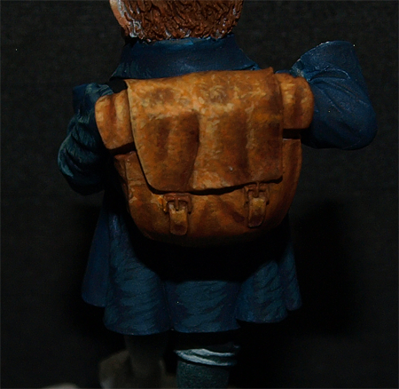
Interpretación de Volúmenes
En este tipo de prendras me gusta forzar mas alguna arruga o inventarmerla directamente para darle mas riqueza, siempre teniendo en cuenta un patrón cenital. Ademas al ser un 54 mm y una zona pequeña no tenemos que tener miedo a la hora de forzar el contraste (si es esto lo que deseamos).
En primer lugar suelo diferenciar los volúmenes básicos siguiendo un patrón cenital y luego pienso que arrugas puedo exagerar. En este caso, lógicamente ira muy iluminada todo la zona superior de la mochila y segun vayamos bajando iremos perdiendo intensidad.
Por otro lado, cabe resaltar que la figura estara ligeramente ladeada, por eso su lado izquierdo tendra mas luz que su derecho.
Volume interpretation
In this type of cloths I like to force some wrinkles or create them to give more richness, always keeping the cenital pattern. Moreover being a 54mm miniature and a little zone, we don't have to be careful forcing contrast (if it's what we want).
First of all I usually difference the basic volumes keeping a cenital pattern and after this I think which wrinkles could I mark more. In this case, obviosly the upper zone will be lighter and going down it will lose intensity.
In the other hand, the miniature is slightly turned, that's why the left side will have more light than the right side.
Here you are a little draw where you can see in red the strongest lights, in green the middle tone and in blue the darker shadows. As you can see in the edge zones the middle tone will do the shadows effects. In this case, the middle tone will help us to mark some wrinkles in the shadows zone.

Colores y capa base
La idea es buscar el contraste entre complementarios que lo lograremos principalmente entre las luces mas prominentes que tendrá mucho amarillo y las sombras mas profundas con purpura. Ademas el amarillo es un color cálido que vendrá bien para iluminar y el purpura es un color frio que vendra bien para sombrear. Al final decidí añadirle algo de amarillo hielo a las ultimas luces para desaturarlas dado que este color tiene mucho blanco.
Para el color base, simplemente he dado una capa de marrón bestial. Recordar que la capa base tiene que quedar bien uniforme y no hay que insistir entre capa y capa para que no nos satine.
Colours and base layer
I have used Bestial brown (citadel) for the base layer, to iluminate I have used light orange, golden flesh and ice yellow (only in small parts and in maximum lights) all from vallejo model color. To shadowing, I have used dark flesh (citadel) and some purple ink for the last shadows and shadow outlines.
The main idea is search the contrast between complementary colours thanks to yellowish lights and the shadows in purple. The yellow is also a warm colour and the purple is a cold colour to the shadows. In the final lights I use some ice yellow to desaturate them because this colour contains a little bit of white.
For the base colour, I only use a bestial brown layer. Remember the base should be uniform and don't insist between layers until it's completly dried.

Primera Luz
First Light
I add a bit part of light orange to the base colour and pointing I marke all the cloth except the light zone. As a previous work, I made this light as a degree and after this I point the surface.

Luces no muy intensas
Poco a poco y de forma progresiva voy añadiendo mas naranja claro mientras voy reduciendo ligeramente la superficie en la que punteo.
Es similar un degradado pero punteando, la diferencia es que si dejamos algun cerco no pasara nada malo y que la pintura no tiene que estar muy diluida para poder texturizar mejor.
Gently and little by little I continue adding more light orange while I reduce the surface that I'm pointing.
It's similar than a degree but pointing, the difference is if we leave a circle it doesn't matter, and the paints doesn't have to be very liquid.


Luces intensas
Una vez llegado a naranja claro puro empiezo a iluminar con naranja claro mas carne dorada. Poco a poco voy definiendo las diferentes arrugas y pliegues.
When you reach the light orange I start iluminating the zone using light orange plus golden flesh. Gently I define the wrinkles.


Sombras
Shadows
to avoid burning the colour, I start doing some shadows to see the overall effect. I start shadowing all the surface with a bestial brown, dark flesh and purple ink in the deeper zones.

Perfilados y sombras
Para darle mas definición empiezo a perfilar en luz con amarillo hielo con algo de carne dorada y perfilo en sombra con marrón bestial mas tinta purpura.
Outlines and Shadows
To give more definition I start outlining in lights using ice yellow and a bit golden flesh and I outline the shadow with bestial brown and more ink purple.

Por otro lado, intento simular algún corte de distintas intensidades. Para ello hago lineas con marrón bestial, algunas, y otras con marrón bestial mas tinta purpura (las mas profundas), para seguidamente perfilarlas en luz con carne dorada y amarillo hielo.
Moreover, I try to simulate some cuts. To do it, I made some lines using bestial brown, and another ones using bestial brown and purple ink (for the deepest ones), and after that outline then in lights using golden flesh and ice yellow.


Remate final
Veo que algunos cortes son demasiado evidentes y que el patron cenital no esta del todo bien aplicado, dado que tiene mucha luz en su lado izquierda. Para arreglar esto, punteo en las zonas ,marcadas en rojo en el primer paso ,con los colores que he usado para iluminar, principalmente con carne dorada.
Por otro lado, velo con carne oscura en algunos cortes y en la zona del tono medio.
Final touchs
Some cuts are very big and the cenital pattern is not well applied, because there is too much light in the left side. To solve this, I point the zones, marked in red in the first step, with the colours that I used to iluminate, mainly using golden flesh.
To the shadows, I glaze using dark flesh in some cuts and in the middle zone where necessary.


Como podeis ver es un proceso bastante entretenido y con resultados aceptables en la mayoría de los casos, dado que no hay que ser muy tecnico para que nos quede bien.
Espero que os haya resultado de utilidad.
Espero que os haya resultado de utilidad.
As you can see is a very entertaining proccess and it has very good results although you aren't a very good painter because is not necessary to have a very good technique.
I hope it has be useful to you.
Muchas gracias por leernos, Zwo
Thanks for reading. Zwo
Muy buen tuto! va siendo imprescindible tener el ordenador con eureka a mano para pintar! gracias artistas!
ResponderEliminaruno no puede mas que quitarse el sombrero ante tan espectacular resultado O.o
ResponderEliminarGenial tuto que pienso consultar de nuevo cuando se me presente la ocasión de llevar a cabo la hazaña de intentar imitar lo que vemos en las fotos xDD
Muchas Gracias chicos. Me alegro de que os guste, es muy entretenido y no es difícil de hacer jejeje
ResponderEliminarNo dudéis en preguntar o mandarnos fotos de vuestros trabajos ;)
Soberbio tutorial!!!
ResponderEliminarAñado tu blog a mis favoritos con caracter inmediato y me apunto todos los pasos para la bolsita del Yarri que estoy destrozando ahora jejejejejeje
Muchas gracias Oscar. Me alegro de que te guste, no dudes en mandarnos los avances de la bolsita :D
ResponderEliminarUn saludo
hola, soy nuevo en el pintado de figuras y este tutorial me parecio excelente, justamente estoy pintando un tanquista sovietico que tiene una chaqueta de cuero negro y voy a tratar de aplicarlo, desde ya muchisimas gracias por enseñar lo que sabes, un abrazo
ResponderEliminarI very much like your toturial but i have one problem with it, you write that you used a color called golden flesh and it´s part of the Vallejo model color i can´t find it anywhere in there line up of colors.
ResponderEliminarIs it possible that you could post a picture of the bottle with the number on it, as it might help me track it down.
Hi Erik, thank for your comment. The colouir is this http://www.hobbymodelismo.es/images_max/70845.jpg.
ResponderEliminarBut, "Golden flesh" is a light flesh with yellow, therefore you can create this colour mixing other colors.
Greetings!
Thanks by the way if the vallejo color number is Vallejo 70845 then where i live it´s called Sunny Skin Tone
ResponderEliminarHi Erik.
ResponderEliminarSorry, but our translation are not good. The color that I used was "Sunny Skin Tone".
Greetings
Very good tutorial.
ResponderEliminarThank you :)
Muchas gracias
ResponderEliminar