

Hoy tenemos el placer de compartir con vosotros este magnifico tutorial de Diego Esteban Perez "Dieguete" sobre Nythgor the unbreakable de la marca HeraModels.
Today we have the pleasure os sharing with you this magnificient tutorial PAP by Diego Esteban Perez "Dieguete" about Nythgor the unbreakable of the brand "HeraModels".


Mi nombre es Diego Esteban, aunque la mayoría de la gente en el mundillo me conoce como “Dieguete”. En esta ocasión he preparado un paso a paso de la figura “Nythgor the unbreakable” en colaboración con HeraModels y el blog Eureka.
Hi my name is Diego Esteban and some of you may know me as "Dieguete". This time I have prepared a step by step article altogether with HERAMODELS and Eureka Miniature Blog.

Normalmente no suelo trabajar de una forma tan ordenada y suelo ir manchando sobre diferentes parte de la figura para ir trabajando en su conjunto y no individualizando, pero en esta ocasión iré trabajando diferentes elementos para que sea más fácil de seguir el paso a paso.
I normally paint in a free mode splashing paint here and there in order to paint the figure as a whole piece, not as a gathering of individual parts, but this time I will afford the different elements every time to make it easier to follow the step by step.
En primer lugar estúdio el ambiente y trasfondo que quiero darle a la pieza, para diseñar una gama cromática sobre la que trabajar y armonizar. También es importante estudiar la composición de la escena si la pieza va a tener una escenografía concreta, como la pintura será para el box art no voy a añadir ningún elemento por lo que solo tengo que preocuparme de la composición cromática de los elementos de la misma.
I start by an analysis of the background and the ambiance of the piece I want to work with. This step allows me to obtain a chromatic range to play and harmonize. Before painting I usually study the composition of the scene I want to show you. That is a very important point to focus if you are planning to add some stuff on the scene, but this time I am going to paint a boxart, so I only need to focus in the chromatic choice. ;)

En mi forma de entender la pintura este primer contacto con la pieza es muy importante, ya que suelo trabajar de forma muy contrastada en los elementos del conjunto pero de una forma muy sutil en cada parte de ellos, creando claroscuros o contrastes de color muy sutiles entre ellos pero que en el global de la pieza contrastan notablemente, resaltando los elementos importantes.
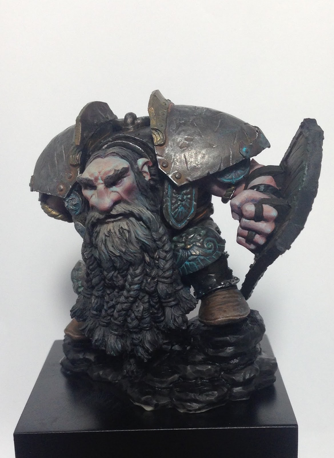
Como es un enano cubierto en gran parte por armadura, el metal será un color predominante y a tener en cuenta. Pensé en un ambiente frío para este enano curtido en mil batallas y decidí que el azul será el color de ambiente. Este color será el más importante en el conjunto pero no el que más superficie ocupara.


In my approach at painting this first contact with the piece is very important. I use to work searching for big contrasts between the whole parts, but in a very subtle way in every one of the different parts. I go from “chiaroscuros” to very subtle colour contrasts always trying to make the most important elements stand out.
As it is a dwarf mainly covered by armor plates , the metallic colour will be predominant in my choice. I imagined a cold ambiance for my worn out old war veteran from a thousand battles, so blue was my second choice. Blue is going to be the key colour, note that even this is going to be the most important one in my project it will not be the one that’s going to cover more surface.


Teniendo claro los colores que forman la base del conjunto, necesito encontrar un tercero común a los dos anterior de una u otra forma, en esta ocasión el naranja es el color que necesito, por ser complementario del azul y formar parte del envejecimiento del metal. Con esos tres colores ya tengo clara la paleta sobre la que voy a trabajar. Estos colores tendrán diferentes tonos, intensidades y saturaciones dependiendo de en qué posición se encuentre dentro del conjunto, para enfatizar o desdibujar zonas concretas de la pieza.

Otro color que estará presente en la pieza y que dará pie al ambiente frío es el tono blanco de la nieve y el suelo que tendrá el terreno al final. Es importante tener en cuenta que este elemento tiene un color ya definido, y no necesariamente incluido en nuestro esquema o paleta, para que al colocar la pieza encima del terreno se nos defina en lugar de desdibujarse.
Once I had those colors in mind I needed a third one, one that has something in common with the metal and blur and helps me to tie them together. So this time I chose orange as it is the complementary colour to blue and a very common colour in the metal corrosion.
Those three colours will have different nuances, intensity, value and saturation along the piece depending on the place I want them in order to define and make some parts stand out from others that I do not want to be so visible.
Another colour that will be present in our piece will be the white from the snow I plan to place on the base. That will help me to push the cold effect. It is important to know that this element has a defined colour in order to use it to help our piece stand out once we put it on the base.
Buscando ese ambiente frío y oscuro de una cima de montaña o una tierra asolada por el hielo, comienzo con una imprimación negra, que apagara la luminosidad de los colores que posteriormente vaya aplicando. De esta forma es más fácil controlar la luminosidad del color en todo momento y si fuera necesario dar más luminosidad a un color simplemente pintaríamos de blanco la zona antes de aplicar el color final que tendrá la misma.
In order to keep a cold and dark ambiance I base coated it with black. This will help me to kill some of the luminosity of the colors I will paint over it. By doing this it will be easier to control the colour luminosity all the time. If we need to push some colour luminosity in some parts, the only thing I have to do is paint white before placing the color over.


Empezando por la cabeza y extendiendo estos colores al resto de partes de la piel comienzo aplicando capas de color carne bastante anaranjadas e iluminándolas poco a poco con turquesas, complementario de esa piel anaranjada y que poco a poco irá desvirtuando la base naranja enfriándola y agregándola en las zonas iluminadas pero manteniendo esos naranjas en los tonos intermedios. Cuando tengo la dirección de la ambientación ya marcada y clara en el esquema aplico algunas carnaciones para dar vida al enano.
I start from the head and from there to all the skin zones. I place some orange tones on the skin and bit by bit I add towards the light some turquoise to the mix. It slowly brakes the orange mix as it becomes colder and colder but keeping this oranges on the midtones. Once I have the ambiance direction planned, I add some incarnations to make the Dwarf look more alive.


Hasta ahora el trabajo ha sido a pincel y es momento de aprovechar el aerógrafo para unificar y suavizar los diferentes colores mediante un filtro de color carne clara. Aplico un filtro para evitar que el trabajo de pincelada con el que empecé a definir el volumen se pierda. Suele ser habitual que se aplique una capa demasiado gruesa de pintura y se pierda el trabajo que hemos realizado hasta ahora. Para crear un filtro basta con diluir la pintura en la cazoleta hasta que tenga la consistencia de una veladura o un poco más concentrada.
Now it is time to use the airbrush. I used it to smooth things out applying subtle filters of clear flesh colour. I do it very diluted to avoid losing the previous brushstroke work. It is important to work quite diluted in glaze consistency in order to no losing the previous work.

En este momento la cara empieza a ganar consistencia y empieza a definirse más claramente. Para que las diferentes zonas gane en definición es conveniente rodearlas de zonas con las que contraste, como el color de la piel es claro me conviene oscurecer las zonas de pelo que la rodean. De momento regreso al color casi negro de la imprimación y le aplico un filtro marrón anaranjado que complemente con los azules que tiene la piel y armonice con los naranjas y rojos de los tonos medios y carnaciones de la misma. De esta forma controlo constantemente el conjunto.
To make the face stand out and defined, we need to surround it with contrasting elements. As the skin is quite clear, I go for a darker hair colour. I go for a black color with some orange-brown filters that contrast with the blue in the skin but harmonize with the oranges on the midtones. By doing this I am in control of the whole piece all the time.


Con la cabeza ya muy avanzada y para evitar que el conjunto se desnivele demasiado es momento de empezar con la armadura, que será el volumen de un mismo material más grande en la figura. La armadura puedo trabajarla como metal no metálico, pero siempre que puedo prefiero trabajar con pigmento metálico. Mi pintura intenta tener un “ambiente realista” y que mejor forma de representar un material “realista” que utilizando un color con similares propiedades al que quiero representar.
Once I worked on the head it’s time to work in the armor. I could have used NMM on the metallic, but I like most to work with metallic pigments. My approach is quite realistic and I do prefer to use a colour that matches it.
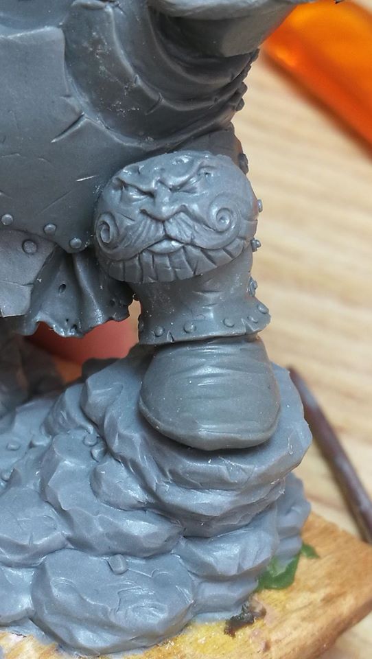
El enano parece ya un tanto viejo por el tamaño de su barba y los desperfectos que tiene, por lo que la armadura debería estar bastante oscurecida y dañada. Nuevamente la imprimación de color negro me ayudara a oscurecer la luminosidad de los colores empleados. . Podría utilizar el mismo color para todas las partes metálicas de la pieza, pero esto la haría demasiado monocromática y afectaría perjudicialmente al aspecto del conjunto, por lo que voy a utilizar diferentes tipos de metal, hierro, oro, bronce y plata.
The dwarf looks old and worn out, so I need a dark colour it. I decided to represent several metallic materials in order to avoid monochromacy. I plan to represent Iron, Gold, Bronze, and Silver.
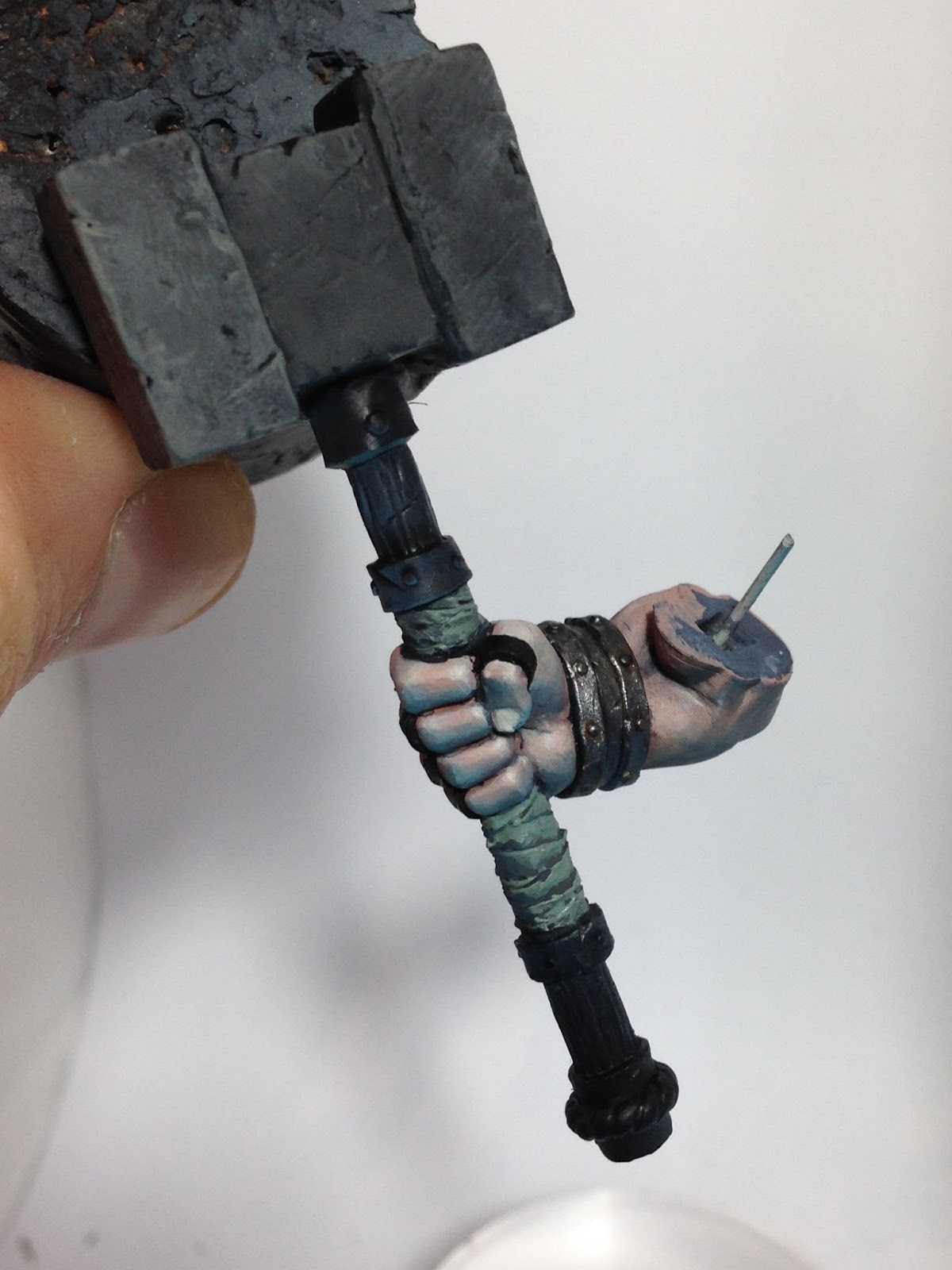
Las piezas más grandes de la armadura las voy a trabajar como si fueran de hierro, jugando con diferentes tonos de naranja para envejecer y oxidar el metal. Como base para este metal utilizo un metálico oscuro de Vallejo mezclado con un poco de tinta marrón y negra para envejecer el color, después a base de aguadas de naranja con negro defino y óxido los diferentes desperfectos de la armadura. Una vez que la armadura está envejecida empiezo a definir los detalles y limpiar alguna zona en la que la aguada ha dejado cerco con el color metálico de base. Definiendo los puntos de luz con color aluminio de Vallejo model air. Es una forma muy sencilla de trabajar el metal y muy efectiva para conseguir resultados muy realistas y con cierta textura de metal algo deteriorado. Se puede seguir trabajando esa textura del metal para hacerlo más deteriorado o menos en función del resultado final que estemos buscando. Dependiendo el tipo de metal el color del óxido es diferente en este caso los metales que más he utilizado son el hierro con óxido naranja, cobre con oxido en turquesa y bronce con oxido en turquesa verdoso. La colocación de los materiales y el comportamiento de estos es importante en el conjunto.
The biggest pieces of armor will be painted as Iron playing with some oranges to make it look weathered. I start form a dark metal from Vallejo mixed with some brown and black ink. Once I have this I apply several washes of orange mixed with black to define some of the weathered parts of the armor. Once the metal looks worn out, I define some elements and clean the zones where the wash leaves some stains. I define the light spots with Aluminum from Vallejo Model air. This is an easy but effective way of painting metal with some texture and damage.
Depending on the material the oxide colour may change as in copper the oxide looks turquoise, in bronze looks greenish-turquoise.


Para centrar más la atención en la cabeza de la pieza que ya de por sí es la parte predominante por el contraste claro oscuro con la armadura y la barba, juego con los metales de alrededor. Creando un círculo imaginario de elementos con tonos azulados que contrastan con los tonos medios anaranjados de la piel por la parte interior de ese círculo y con los óxidos naranjas de las otras partes de la armadura por fuera consigo potenciar la luminosidad de la cara.
As said before, the contrast between the clear skintone and the dark hair makes the face stand out, but in order to catch even more of the viewers attention I do play with some metals around. I try to create an imaginary circle of elements with bluish tones that will contrast with the orange tones of the skin midtones and the orange from the rust on the armor plates. By doing this I am able to boost the face luminosity even more.


La mayor parte de la figura ya está resuelta a falta de definir y afinar los elementos. Para las partes que son más pequeñas y van a ir en segundo plano como calzado, anillos, vendas y madera hay que tener en cuenta la posición que ocupan en el conjunto antes de pintarlas. Un color fuera de esquema o no conjuntado con el resto por pequeño que sea haría perder fuerza a la miniatura llamando demasiado la atención. En este caso voy a trabajar con diferentes
tonos de colores predominantes para reforzar la sensación de frío de la que partió el esquema cromático. Se podría utilizar un color fuera de la gama para dar importancia y visibilidad a un elemento o zona concreta.
The biggest job is done by the moment and we only need to define and sharp some of the elements. For the not so important elements (shoes, rings, wood…) we need to study its position before we paint them. This time I used different tones of my main colour choice in order to keep the cold ambiance. If you want to make something pop out or catch some more attention you can also play with some colour range variations ;)


Teniendo todos los elementos coloreados es hora de trabajar el conjunto y el terreno montados para reforzar el ambiente y la armonía de todos los elementos, para que todos ellos dibujen el conjunto.
Once everything is painted I work with the whole piece and the terrain to make sure that the ambiance and the harmony between all of the elements is working.


Normalmente se tienen a pintar las partes de una figura por separado para facilitar el trabajo en los distintos elementos que la componen pero es imprescindible trabajar continuamente con el conjunto para que la pieza sea un bloque y no la unión de diferentes partes.
Sometimes we are forced to paint a project by dividing it in smaller parts or steps, but you always have to keep in mind that this will end being a whole piece not a gathering of different parts assembled.


Durante el paso a paso no sigo recetas de color o utilizo siempre los mismos botes o tonos de color, únicamente para cosas muy concretas y más por gusto personal de acabado que otra cosa. Con esto quiero animaros a que no encorsetéis vuestra pintura con recetas de ABC, si tenéis claro el color que queréis y para que lo queréis buscar el tono concreto que os ayudará a conseguirlo es sencillo.
As you may have noticed, I have not given you any colour recipe. I do not use them and I would love to encourage you to paint bravely and do not limit yourself to an ABC step by step kind of painting. If you’re looking for a tone and it is clear in your mind, do not search for it in a bottle, mix your palette and try to find it there, it’s easy and fun.


Espero que este paso a paso os ayude a enfocar vuestros proyectos, un saludo a todos y gracias a Eureka por dejarme colaborar en su blog. Para los que no la conozcáis la figura de Nythgor es una figura de edición limitada modelada y diseñada por Raúl García Latorre para HeraModels.
Podéis echar un vistazo a su página web: www.heramodels.com
I Hope that this article helps you to afford new projects ;).
I would love to thank Eurekaminiature.blogspot.com for letting me collaborate with them.
For all those who do not know the sculpt, Nythgor is a limited miniature from the mind and the hands of the great Raul Garcia Latorre released by HeraModels. Check this and other great pieces in HeraModels site: www.heramodels.com
Tampoco os perdáis el tutorial de la version de Marc Masclans en la web de Volomir!!
Tampoco os perdáis el tutorial de la version de Marc Masclans en la web de Volomir!!


INCREÍBLE !!! Grandísimo el artículo , lo leeré con calma ! mil gracias por la publicación como siempre !
ResponderEliminarGenial paso a paso!, muy esclarecedor.
ResponderEliminarSaludos, Juan Pablo
Verlo en mano fue brutal , encantado también de conocerte Dieguete 😜
ResponderEliminar